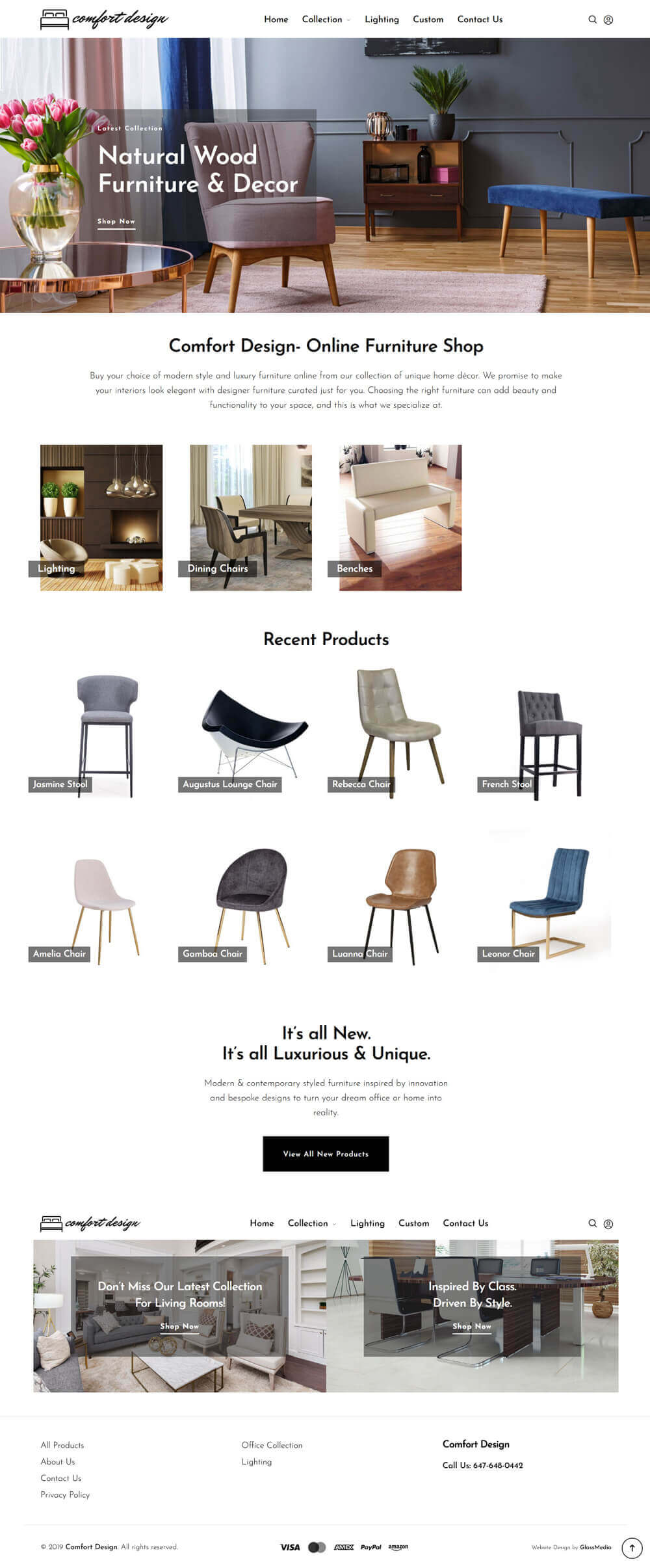
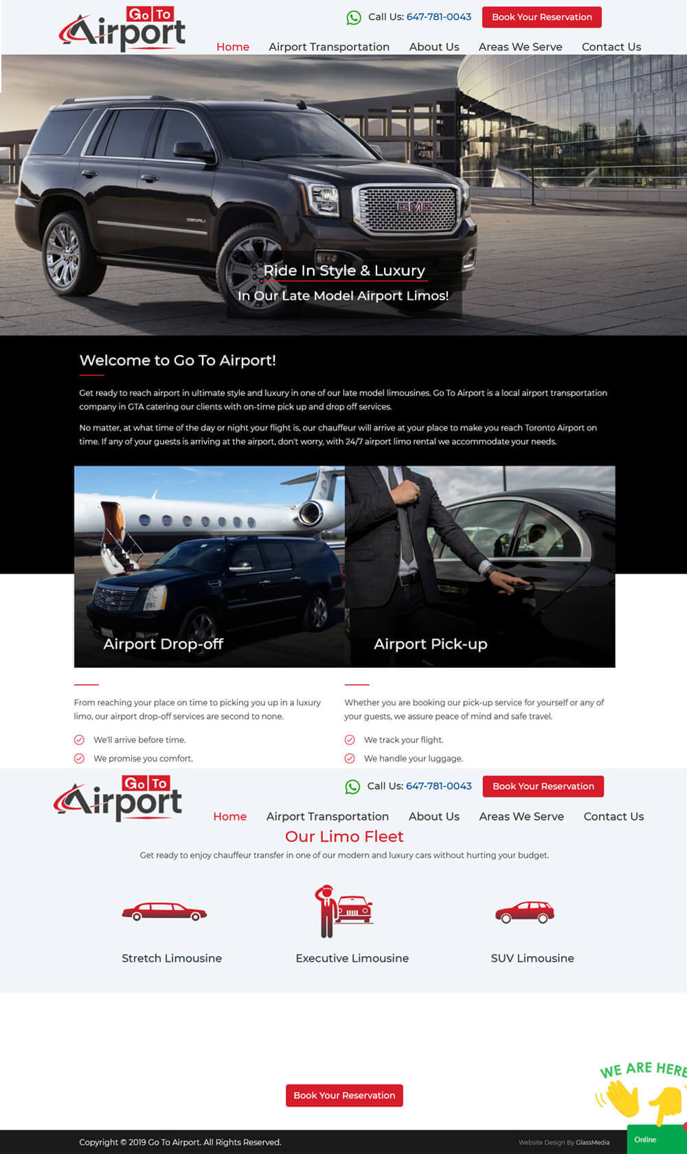
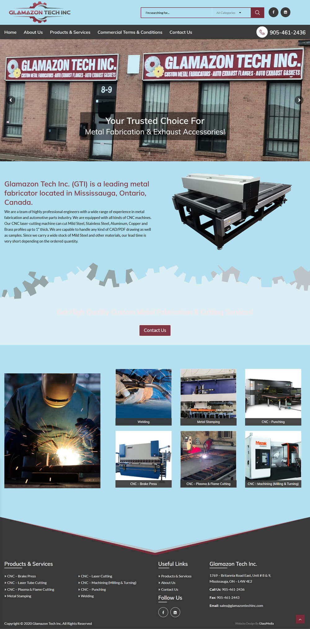
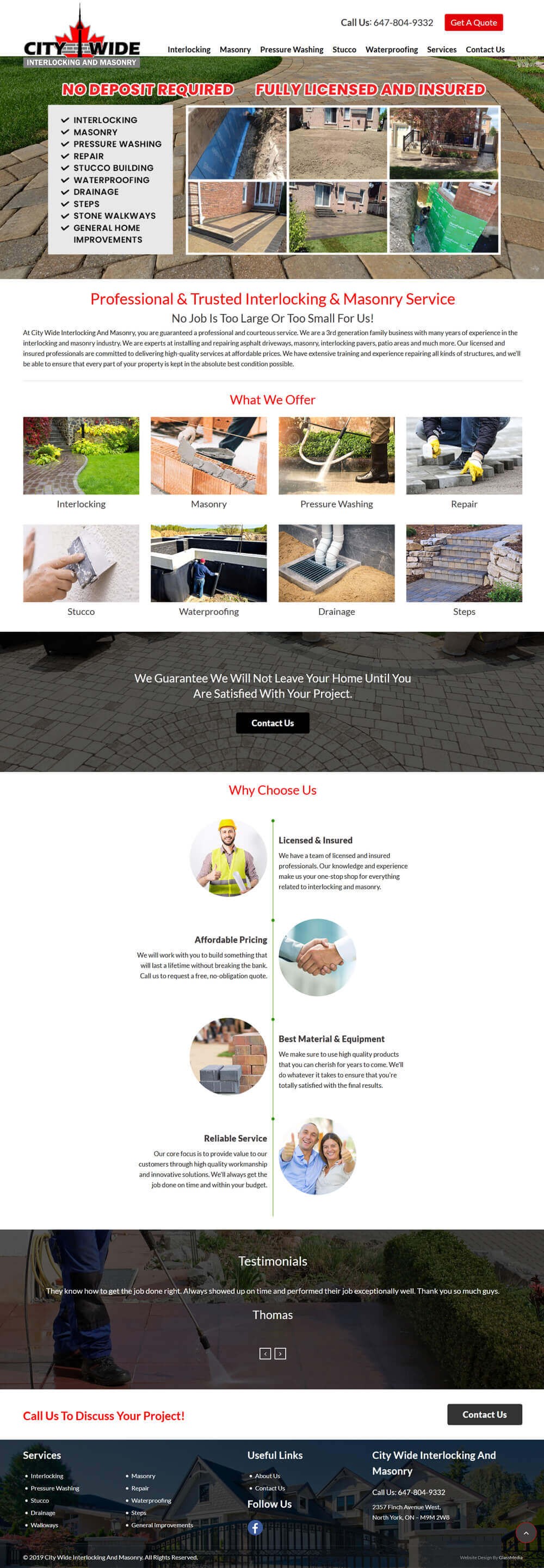
Mobile website design is piping hot with ever new trends entering the mainstream. After witnessing an amazing growth in 2015, the year ahead also seems to reflect this phenomenon. We are certain that 2016 will see significant dynamic trends that will further flourish in the coming years.
Let’s take a look at some of the defining trends in mobile web design that are most likely to stay.
-
Mobile or Nothing
Ever since responsive websites pervaded the web design industry in 2012, they have grown leaps and bounds. The reason for their success is attributed to the wide spread focus towards mobile optimization. The user-friendly features along with intuitive freshness of these websites attracts not only desktop viewers but leave a mark on the mobile web design as well.
As Time Magazine firmly puts it, “the future of the internet is mobile”. More businesses will shift their focus towards mobile websites and responsive themes seem to be the right alternative. If you want similar high performing mobile websites, simply get in touch with our web designers in Brampton to accomplish the task successfully.
-
Clicking is Dead
Clicking isn’t loved these days. People now love to scroll! People browsing on mobile devices now love to scroll down, read, grasp information and choose further action. More and more web sites now offer single page information that is accessible through scrolling. Instead of clicking through numerous pages, users just scroll down which is easier and quicker. No more page loading issues. Also, 3-D parallax trend now makes sure scrolling isn’t boring with its interactive experience.
-
Videos are Entering Mainstream
Mobile users are gifted with excellent screens compared to desktop users. No wonder they love to watch a video when given a choice. More and more videos are added to the pages in order to attract the video watching mobile crowd. This personal and unique way to deliver content is fast catching up and is likely here to stay.
-
Resurgence of 2-D Designs
3-D designs, icons and beveled edges no longer tempt the designers. These days, 2-D flat designs are making waves due to their visually appealing premise. These designs feature simple layout accentuated with subtle color here and there, driving focus on typography.
-
Animated Elements Will Rule
If you think animation is just being used to make you stand out from the competition, think again. Now, animation will play a more functional and motivational role. It would be used to entice your users by giving them pleasant and effective experience. With animated elements, a website will coincide more with typical human behavior opposed to technical and ‘dead’ experiences.
-
Blur Background is Nailing It
There is no denying that blur effect has been around for a while, but its demand is soaring in mobile designs. Blur effects are used to add elegance, while highlighting the important elements of the design. Blurred imagery put a spotlight on the interactable stuff so the users know where to go. Users will surely see this kind of cool trick in 2016.
Do you wish to integrate any of these trends in your website design? Contact our web designers and developers in Brampton to get more information about the latest designs and marketing trends in mobile website designs.
- Tags:
- Mobile Web Design ,
- Web Design ,
- web designs

